خيارات التسجيل
Learn about selecting the most appropriate graphs and charts. This course is ideal for beginners.
Introduction
Data is information: a collection of numbers, words, measurements, facts and statistics.Data is not useful unless it is presented in an appropriate way.
Data is the basis for the creation of graphs and charts.
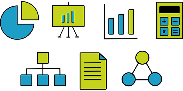
Graphs and charts are visual representations of data and the following are the most commonly used:
Bar charts, pie charts and line graphs.
A visual representation of data allows:
• Easier extraction and interpretation of information
• Comparison between the different elements of the data
• Presentation of large pieces of information in a small space
You will learn
- Recognise why data representation and selection of the appropriate graph and chart is important
- Distinguish between the different types of data presentation
- Identify what a bar chart, a pie chart and a line graph are
- Select the most appropriate graphs and charts to represent your data
لا يمكن للضيوف الوصول إلى هذا المساق. يرجى تسجيل الدخول.